Home Page Usability
The homepage is different from all other website pages. A well-constructed homepage will project a good first impression to all who visit the site.
It is important to ensure that the homepage has all of the features expected of a homepage and looks like a homepage to users. A homepage should clearly communicate the site's purpose, and show all major options available on the website. Generally, the majority of the homepage should be visible ‘above the fold,’ and should contain a limited amount of prose text. Designers should provide easy access to the homepage from every page in the site.
11 tips for homepage usability
1. Make your site’s purpose clear.
A good one-sentence tagline is important in helping to establish what your company does. Many people may never have heard of you and won’t automatically know what you do. People are impatient. If you don’t make it clear what you do within seconds, they will not stick around to try and find out.
2. Have a good Title tag.
This will become important for search engines and for when people bookmark your website. Use your company name and a brief description.
3. Group your company information in one clear place.
Good, accessible company information is vital if you want to inspire confidence and credibility. As well as displaying some details on the homepage, make sure you have and ‘About Us’ link clearly marked on the homepage.
4. Emphasize your sites main purpose or task
Clearly mark the starting point for the main function of your website. E.g. If it’s for selling cars, then clearly mark where and what you have to do to find and buy a car.
5. Include a search box
For reasons outlined before, it is very wise to include a search facility. Many people when first visiting your site will scan the page looking for a search box, so make sure it is clearly marked (and make sure it actually works!).
6. Use real content
Don’t just describe what is in your site, use real examples. This will entice them in better than any abstract references will do.
7. Start links with keywords.
Don’t use terms such as ‘click here’. Links are your action items and users will scan down your web page for the link that will take them to what they want. Using keywords will help them differentiate between links.
8. Ensure your page downloads fast.
If your homepage does not start to download within a few seconds, that may be too long. The general rule is that a homepage should download within 10 to 30 seconds. The closer you can make it to 10, the better. But, don’t forget your other pages. If you use many of the graphical elements on your homepage throughout the rest of your web site, this will ensure they download fast too – as many of the items that go towards making up the page will already be in their cache.
9. Don’t over format your critical areas
If you make certain areas too elaborate, users may mistake them for ads. Use visual design to enhance, not define interaction design.
10. Use meaningful graphics
Don’t overdo it with images and stock photography. Make sure the images are relevant to your company and the website. Many times your images may seem frivolous. Remember, that many first time users may pay no attention to your graphics.
11. Another area that is often overlooked is your contact details.
For many websites this can be the number one reason why the user has paid a visit. They want to find out how to contact you, where you are located, what’s your email address, do you have a phone number. As well as being very practical, it inspires that all important confidence and credibility in you. However, it is surprising the number of well know websites that fail even this basic requirement. Many either don’t display full contact details or hide them away in some obscure part of their site (http://www.cdnow.com/). Make sure you display it prominently either on your homepage or as a clearly marked menu item.
Please click on the following link to have a look on checklist which needs to be taken care while designing a homepage:
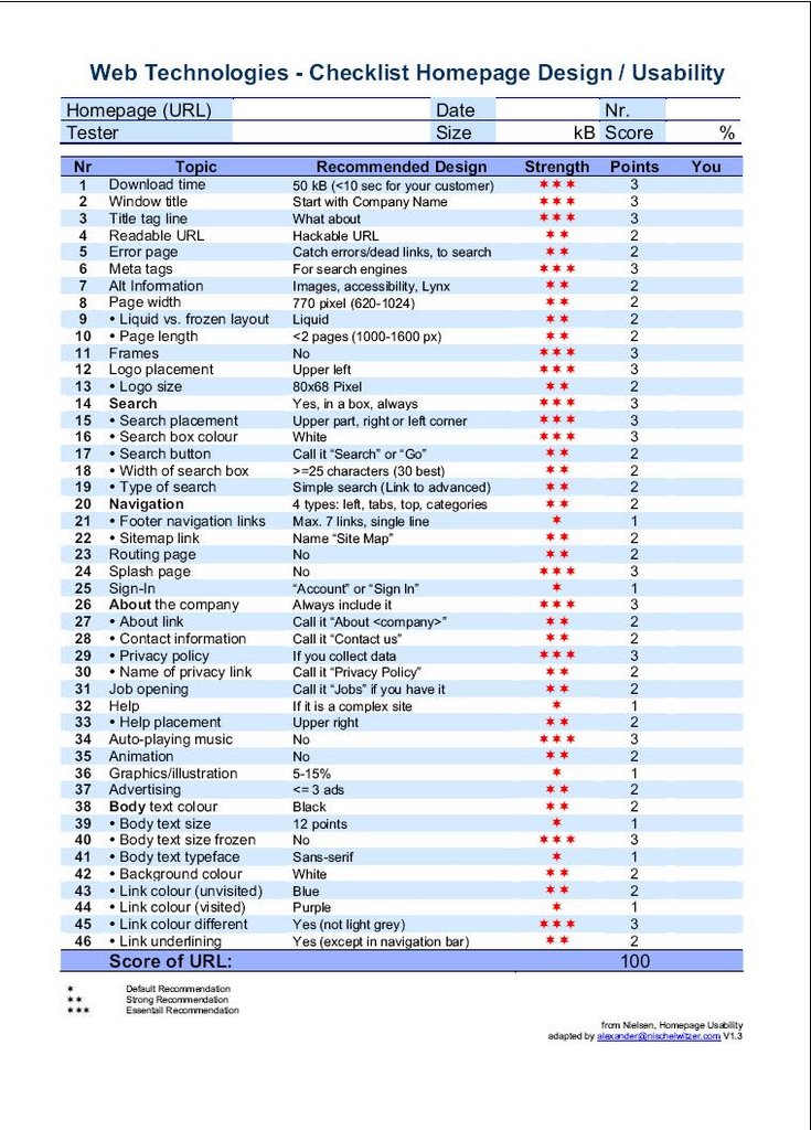 ( Click on Image to Enlarge)
posted by Rajat Bhardwaj @ 2:01 AM
![]()
1 Comments:
At 10:37 PM, Gargi said…
Hi Rajat
Thanks for this very useful information.It has really given a good insight about Uability Testing.
Can you please clarify this doubt for me.
According to the checklist you provided,why is it that the URL should be a Hackable URL(Point 4 in the checklist given)?
Thanks!
Gargi
Post a Comment
<< Home